Design is an incredibly huge part of my life. Since 2013, I have been putting my creative passion for design into action for Amara. Being the design manager is such an interesting role to have as every creative project passes by me first… It’s safe to say I have a hefty collection of design knowledge up my sleeve and ready to share with you all! Working for Amara Living by day, I’m also part of the Interior Blog Awards team. I absolutely love seeing the success of each of our participating bloggers, year on year! Working with the IBA’s allows me to share even more of my design insights to fellow bloggers. Pivotal to so many aspects of blogging, your website’s design is your shop window. It is your magazine cover. It is, ultimately, a digital version of you! Your blog’s appearance and whatever you create represents you. It all comes together to portray a certain message to your followers, both present and future! How you choose to appear is entirely up to you and I’m going to help you nail the oh-so crucial design…
Life is better in colour.
Ever heard of Adobe’s colour wheel? No?! You’re in for a treat. This super handy tool helps you create colour schemes. Compare how well colours go together or change up the dials and develop your own palette. There’s also a range of options where the website automatically generates complementary colours, shades and more. Give it a whirl (geddit?) This handy little tool also features in my list of sites for design inspiration!
*I’ve got a blank space baby*
It’s time to embrace the white space! If an element on your blog adds no value for your reader… Lose it. Ditch the clutter and you’ll find your blog design looks so much cleaner, clearer and crisp. Not sure where to start? So many blog headers distract the reader’s attention away from discovering your awesome posts. Consider stripping that back and you’ll find it streamlines your blog’s initial appearance.
For Font’s Sake… Be selective with your typefaces.
I recommend you limit to 3 fonts across your blog and graphics! Aim for a combo of serif and sans serif fonts. If you’re a fan of more colloquial, handwritten styles, remember it all needs to be READABLE. Here is Google’s list of ‘web safe’ fonts.
Refine your photography
Unashamed self-promo right here… Go follow me on Instagram if you aren’t already! Develop your photography style; Experiment, fine-tune and gather tonnes of variations when you’re shooting. You’ll then have the luxury of being selective with which images you go on to use! Plan your shots, practice and you’ll only ever get better. You’ll notice from my Instagram, I love shooting flatlays. I’ve also got an insatiable penchant for monotones and marble! You could always try using stock imagery – Be sure to check usage rights. Look out for imagery with a ‘creative commons’ license and check their guidelines on attribution too! My biggest secret when it comes to shooting blog photography? It’s all down to lighting. For both still life and portraits, make natural daylight your best friend. Try shooting with it directly overhead for minimal shadows. Psst, early morning light is gold dust!

Photography presentation that packs a punch
You worked so hard creating beautiful images. Now, add a professional edge to the way you present them! Try aligning your images or experiment with simple grids. Your images might look beautiful but it’s also super important to not let their file sizes drag your site speed into the stone age. Optimise your images during upload or see what my lovely friend, colleague and SEO expert, Alina, has to say!
You’re halfway through my list of Blog Design Tips. Want some more creative inspo? Explore the ‘Design’ category for more.
Ready for another dose of design tips? Of course you are. Keep scrolling…

Prioritise & categorise
Decide on your blog’s main focuses and organise your posts into clear categories. Refine your homepage. Prioritise your most important, ‘headline’ content to the top of your page. Your blog design will, in turn, become less cluttered and distracting. Think about your layout and what makes the most sense – Allow your readers to easily find the posts they love. If you can make reading your blog as pain-free as possible for the reader, you will seriously increase the chances of them popping back for your next post!
I ain’t afraid of no ghosts code!
Don’t feel like you can’t put your own twist on your blog if you’re not a designer or a coder! So many design tweaks can be made without the need for a brain full of coding knowledge. Try handy plug-ins to make tweaks to your blog such as Visual Composer.
Oh and, if it isn’t broken… You don’t necessarily need to fix it. Make a few small tweaks to start with – Trying just one or two of my tips will help you on your way to a better blog design!
Create your own reality (and blog graphics…)
There are plenty of platforms out there perfect for creating graphics. Which one is best for producing designs specifically for bloggers? Canva, Adobe’s Spark and PicMonkey are just three options for easily creating graphics with. They each have templates which you can adapt to suit your design style and the online communities for each are bursting with video tutorials, how-to guides and *normally* a loads of shiney happy people laughing.
Want to be taken seriously? Be consistent.
I truly believe having a consistent style is crucial when you’re a blogger. Ensuring your content is instantly recognisable as yours, consistency is KEY! Coherent branding that is fitting with your blog’s voice is totally what you’re aiming for here. Solid design consistency will see you present yourself as a professional, reputable blogger to newbie readers too. It’s your fast-track way to ensuring a pulled-together image. It’s not just crucial to design… Check out what social media-savvy ‘This Essex Girl’ has to say about being consistent over on Instagram!
Be your own inspiration!
Ultimately, create your own style. It’s easy to copy what everyone else is doing – It can certainly seem like a sure-fire way to a ‘successful’ blog design… But, what about being true to you?! Aim to make your blog a genuine reflection of yourself and your passion for what you write about.

So, you’ve got all the tips but you’re not too sure where to start? Kickstart your creative flow by fine-tuning a colour palette, jotting some ideas into a journal or creating 2 moodboards: One for your current blog design and the other bursting with ideas for your DREAM blog design. If you need a little nudge of inspiration, be sure to check out the 5 sites that I love for a dose of design inspo.
Fancy giving any of my blog design tips a whirl? Do let me know – I’d love to hear all about your blog design journeys so do be sure to fire any questions my way in the comments below or over on Twitter &/or Instagram!


2 Comments
Thanks for this, I’m always really nervous about using too many fonts so it’s nice to have some guidance!
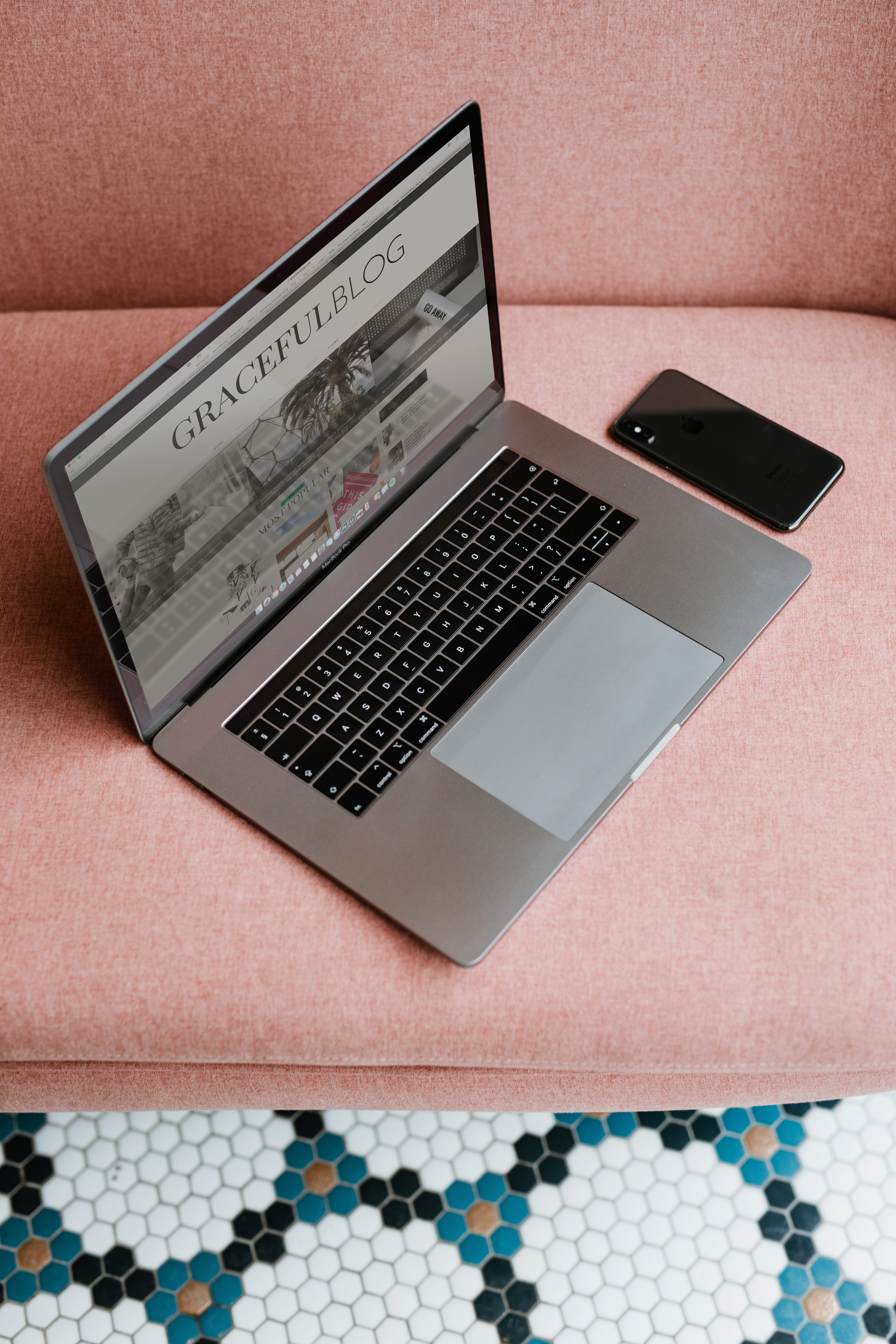
Love this! Some really good tips as I think it can feel overwhelming at times with so many different choices to make! Where abouts is the top photo taken? I am obsessed with the colour of the sofa and the flooring!!
xx
Leave a Reply